
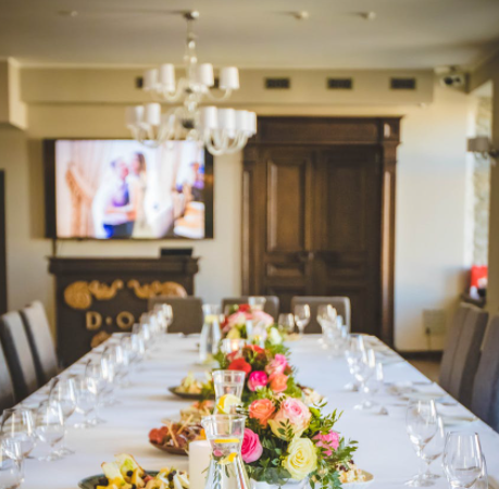
When you sit down to eat, whether it is with family or with guests, the quality of the food is clearly one of your highest priorities. You probably also give thought to the appearance of the dishes and cutlery, the comfort of the seats, and numerous other considerations. Do you ever think about the paint? Does interior paint register among your thoughts? Maybe it should! The quality and color of your dining room paint can have a surprisingly strong influence over how pleasant it is to eat there.
In the interests of improving your dining experiences, here are a few interior painting tips that you can consider when it is time to repaint your dining room.
Paint Color Choices for Dining Rooms
Those who study color psychology suggest that the best interior paint colors for an eating area are those we associate with foods. Red, like tomato sauce or cranberries; green, like lettuce or herbs; brown, like the skins of potatoes or fried chicken; beige, like fresh bread; yellow, like butter or corn… there are so many options to choose from! In contrast, there are some paint colors that are only rarely associated with foods, such as gray, blue, black, and pink, and these are typically avoided in kitchens and dining rooms.
Another consideration for your paint color is the overall mood you want to create. Warm colors like red, yellow, and orange tend to make a livelier, more energetic environment. Cool colors such as green and purple have more of a calming effect. Beige and tan are also moderately sedate, while a deeper brown has more of a formal, stately vibe. Lime green or egg yolk yellow would lend themselves to an offbeat, eclectic feel.
Can a Color Be Too Bold or Overwhelming?
Some colors might seem too bold for a dining room. For example, a beet red or a pumpkin orange could easily overpower a space, as could lime green and many others. Can you still use these paint colors in a dining room?
Absolutely!
One consideration is how much wall space there is, in comparison with windows, doors, hutches, and other large items. If the room is mostly made up of painted walls, a bold color might be too much, but if there is a significant amount of window space, painted trim, and other décor, the stronger colors should not be overwhelming.
Another way to use richer hues is if you use them on the lower portion of a wall, but paint the upper portion with a lighter, gentler, or more neutral tone. The horizontal divider between the colors would be a bit of chair rail or similar trim. Alternatively, if the lower portion of the wall is white wainscoting, a bolder color can be used above.
Finally, you can use your rich color on just one wall to create a focal point, and use a tamer tone in the rest of the room.
Quality Painting Matters!
It doesn’t matter what color scheme you choose for your dining room if the painting is not done well, or if the walls are worn and scuffed. You want crisp lines, smooth walls, uniform colors, and a fresh overall appearance. This kind of interior painting requires experience and skill, as well as high-quality interior house paint.
For homeowners in New Jersey and the Philadelphia region, Cherry Hill Painting is a name you can trust for exceptional quality and outstanding customer service. We provide interior painting for homes and businesses throughout the area, as well as exterior painting, kitchen cabinet refinishing, wallpaper removal, and more.
To receive a free estimate for your dining room painting, or any painting project around your home, you can use our online contact form (below) or call our office. We look forward to meeting you!